
 Widget Customization
Colors and Branding
Change the widget color, layout theme, and color mode to match your brand.
The widget color is the single biggest branding lever. It controls the chat bubble, the widget header, and the send button - changing it makes the widget feel native to your product.
All appearance settings live under Settings → Apps → [your app] → Chatbox → Appearance.
Widget color
Under the Chatbox color setting, pick any hex color or choose one of the preset swatches. The color is applied immediately in the preview.
Eight preset colors are available as quick-pick swatches. To use an exact brand color, type the hex value directly into the field (e.g. #2563EB).
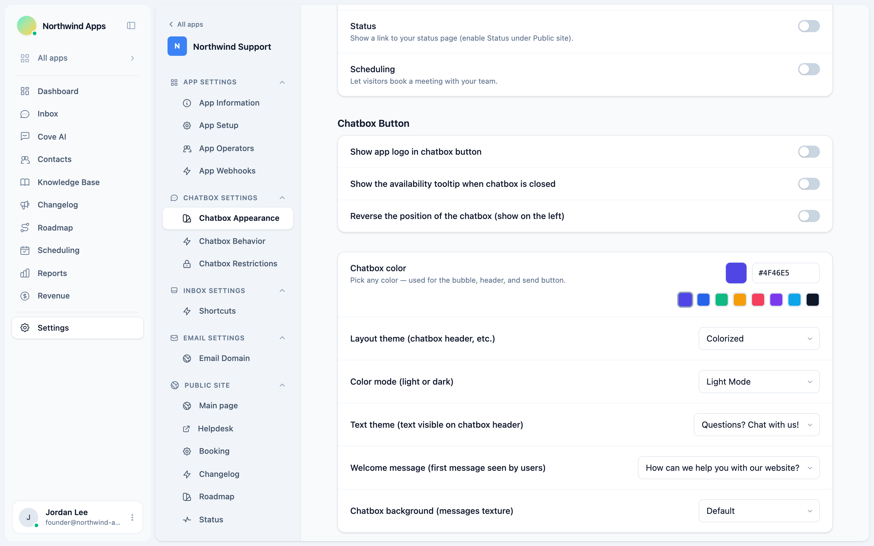
Layout theme
The Layout theme setting controls the style of the widget header and overall chrome:
| Theme | Description |
|---|---|
| Colorized | Header uses your brand color (default). |
| Minimal | Lighter, more neutral header. |
| Classic | Traditional full-color header. |
Color mode
Color mode controls whether the widget uses a light or dark background:
| Mode | Description |
|---|---|
| Light Mode | White/light grey backgrounds (default). |
| Dark Mode | Dark backgrounds throughout the widget. |
| Match system | Follows the visitor’s OS preference. |
Text theme
Text theme controls the tagline text visible on the widget header when the widget is closed:
| Option | Text shown |
|---|---|
| Questions? Chat with us! | Default, general-purpose. |
| Need help? We’re here. | Support-focused. |
| Have a question? Ask us. | Sales-friendly. |
| Chat | Minimal, no tagline. |
App logo in the launcher button
The Show app logo in chatbox button toggle replaces the default chat icon in the launcher bubble with your app’s logo. Your logo is set under your app’s general settings.
Background texture
Chatbox background adds a subtle texture to the messages area:
- Default - plain background.
- Rails, Dots, Grid - light geometric patterns.
- None - completely plain.
Next steps
- Launcher and position - control where the bubble appears.
- Welcome message and greeting - set the first message visitors see.
Was this article helpful?
Thanks for your feedback!